Design by Limitation: A Three-Cover Experiment
For this project, I designed a series of textbook covers for an introduction to graphic design course. My goal was to explore how much visual impact can be created using fewer colors, fewer elements, and a strict, self-imposed design rule: the covers could only be built with text and the colors red, black, and white.
Working within these limitations pushed me to think more critically about hierarchy, scale, alignment, and rhythm. Without illustrations or imagery to rely on, typography became both the structure and the subject. Each cover uses type not just as content, but as a graphic form — shaping composition, movement, and emphasis.
Across the three designs, I approached minimalism from different angles:
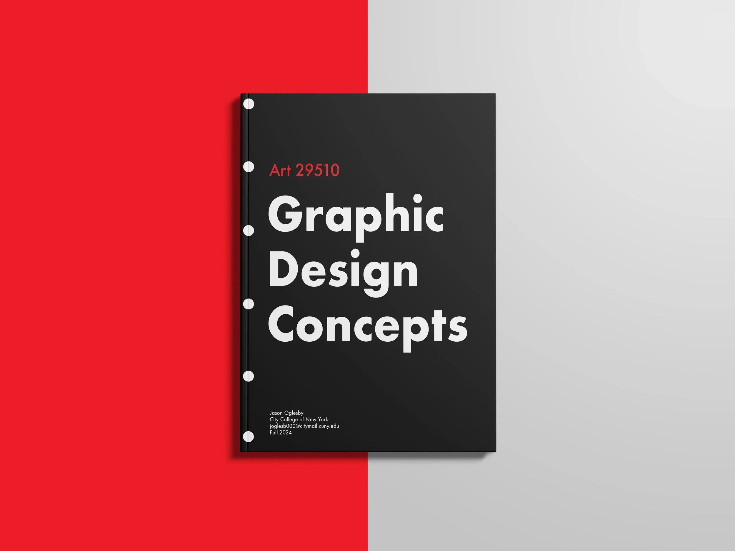
Cover 1 uses bold, geometric type and circular punch-hole imagery to reference traditional course notebooks, grounding the design in academic familiarity while still feeling modern.
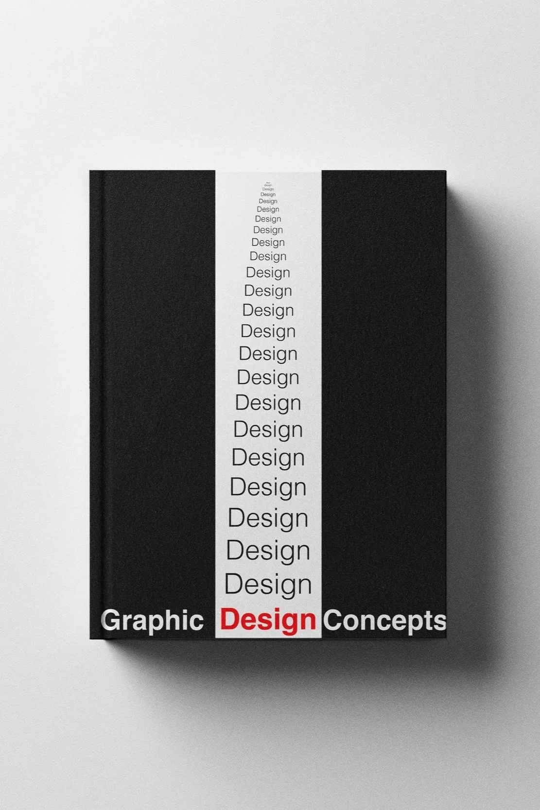
Cover 2 plays with repetition and vertical flow, turning the word “Design” into a visual column that guides the eye downward. The single red “Design” at the bottom creates contrast and anchors the composition.
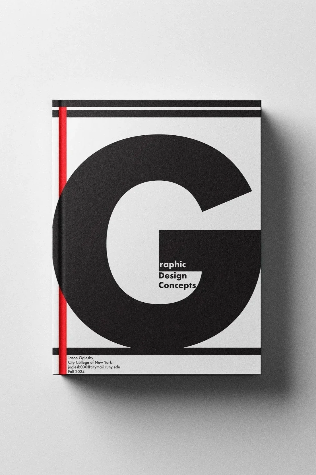
Cover 3 focuses on scale and negative space, using an oversized letter “G” as both a dominant graphic and a framing device. Thin red and black rules add structure and movement without distracting from the core concept.
Limiting the palette to red, white, and black intensified the focus on form and contrast, echoing classic design movements such as Swiss Modernism and early Bauhaus typography. The restraint became a creative tool: every choice had to be intentional, transparent, and communicative.
Together, the three covers form a cohesive series that highlights how typography alone can define identity, mood, and hierarchy. This project strengthened my understanding of typographic systems, minimalistic design, and the power of working within limitations to spark creativity.


